


Online customers abandon shopping carts all the time, but it doesn’t mean they can’t come back and complete the purchase. Abandoned cart emails are needed exactly for that purpose. In fact, they do it really, really well.
In this article, you’ll see how effective an abandoned cart email is for sales recovery. You’ll also discover the key components and strategies to rely on to craft the best abandoned cart emails.
What are abandoned cart emails?
Abandoned cart emails are automated messages sent to those who have added items to their online cart but left the website without buying anything. These emails serve as a reminder to customers and help you get some of them back. The most basic abandoned cart email shows the product, contains a call to action, and optionally offers extra benefits like free shipping.
Abandoned emails are considered to be a big part of the customer journey and give you another shot at conversion.
The role of abandoned emails in e-commerce
According to Statista, in 2025, cart abandonment rates are steadily at 70%. For years, that rate has mostly increased. Baymard Institute estimates the average worldwide abandonment figure at 70.19%. The reasons people abandon online shopping carts vary from a short attention span to various issues customers encounter on the way to a check-out — a lengthy process, confusing UX, unsatisfying delivery options, etc.
When only 1-2 customers out of 5 end up purchasing, the abandoned cart email is a way for businesses to win them back. It is a working strategy: as per Klavio’s report, average abandoned cart flow has the highest repeat purchase rate (RPR), conversion rate, and placed order rate. For example, the average RPR for those emails can get as high $28.89. In simple terms, abandoned cart emails drive sales and purchases like nothing else.
Reasons abandoned cart emails help recover lost sales
There are a couple of reasons why abandoned cart emails are so effective:
- Personalization. Customer receive messages crafted just for them — with their name, the product they left, and similar products to choose from.
- Incentives. Abandoned cart emails often include discount offers, free shipping, or limited-time deals.
- Urgency. Timers or “limited stock left” types of offers usually persuade shoppers to finalize their purchase.
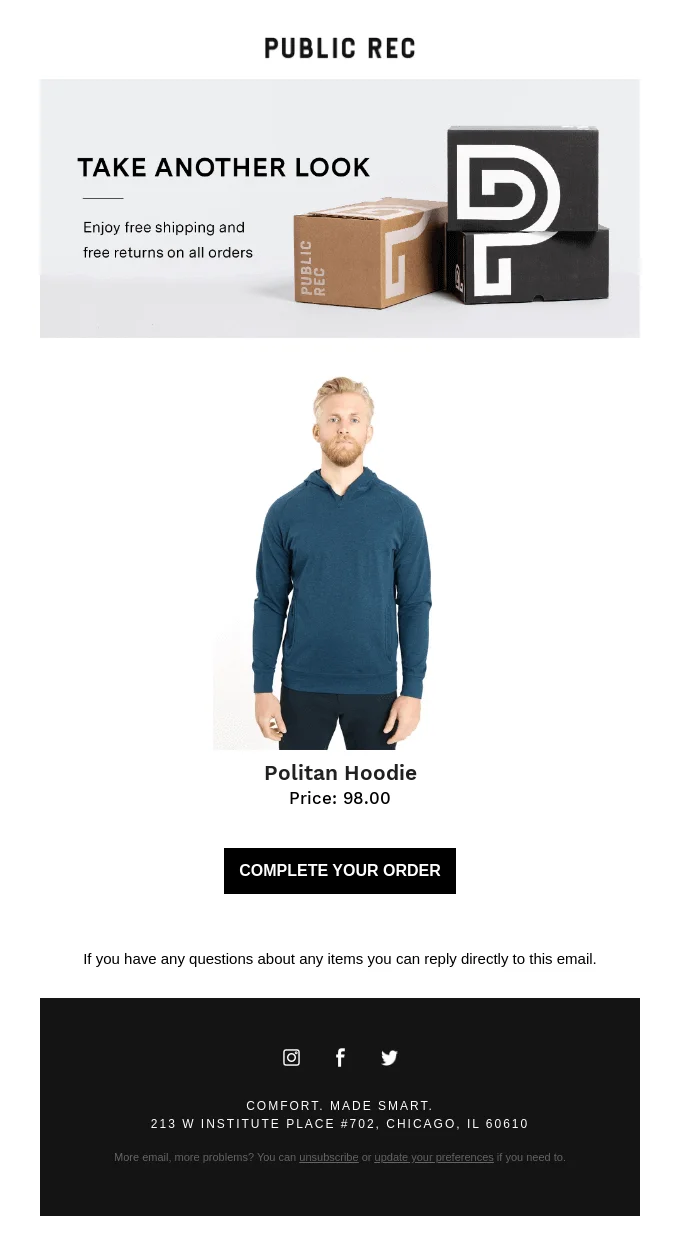
Below is a good example of an abandoned cart email with CTAs (“Take another look” and “Complete your order”), a nice picture, and a free shipping offer.
Be warned that despite the promising stats, an abandoned cart email is not a magic-wand strategy. It’s more like a pill when the cough is getting nasty: it will ease the pain, but it is better to prevent the cough by putting on warm clothes.
It’s still preferable if customers complete purchases by themselves in one session. Let’s see why they often don’t.
Abandoned cart emails and data privacy in 2025
In 2025, the legality of abandoned cart emails is closely tied to data privacy and laws, like GDPR and CCPA. Compliance requirements can differ depending on your location, but generally they include:
- First-party data. Your customers need to knowingly provide you with data in most cases.
- Consent from consumers. You’ll need opt-in consent from your clients before sending marketing emails, including online shopping carts ones.
- Unsubscribe options. Every marketing campaign email, including cart recovery messages, must include a clear unsubscribe link.
The good news is that transparency helps you to build trust with your customers. Brands that follow these privacy-first practices tend to build more trust — and trust translates into higher engagement.
Key elements of a high-converting abandoned cart email
The elements you need to consider while writing an abandoned cart email include:
Subject line that grabs attention
Most recipients decide to open an email based on a subject line alone. You can use several attention-grabbing subject line templates to try to rekindle the interest.
- The forget-based subject lines
- You forgot something (Public Rec)
- Wait up. Your order is not complete (Blu Dot)
- Leave something behind? (Moment)
- Reason-based subject lines
- Hey, forget something? Here’s 20% off (Bonobos)
- Free Shipping On Your Huckberry Order (Huckberry)
- Complete the purchases with 20% off now (Cozy Mug)
- Fear of missing out
- Price drop on your favorites! (Columbia)
- Nomad Gear is Selling Out Quick (Nomad)
- Get Them for 15% Off! (Alex Mill)
- Personalized subjects lines
- The journey to London Kings Cross won’t be the same without you (LNER)
- Still interested in the Massdrop x MiTo SA Pulse Custom Keycap Set? (Mass Drop)
- Did you forget this, Bob?
- Creative copywriting subject lines
- Sorry to hear about your Wi-Fi (Adidas)
- Oooh, good choice! We set it aside for you (Food 52)
- Your basket is having abandonment issues… 🙁 (Jack Wills)
Personalization and dynamic content
In 2025, there are no excuses for a lack of personalization in your emails. Shoppers expect relevance now! Personalization is the process of sending targeted emails when people see email content based on data available about them. Modern ESPs (like Selzy, for example) allow you to create emails that are tailored to specific customers or segments.
Dynamic content allows brands to automatically insert product recommendations, recent reviews, low-stock alerts, or time-sensitive discounts directly into each email. Thanks to AI-powered tools and integration with CRMs and ecommerce platforms, personalization can reflect a user’s browsing history, preferred price range, and other factors. This increases the chances of cart recovery without crossing privacy lines.
Wonder what it looks like? Learn more about personalization, dynamic content, and AI tools with these 4 email marketing lessons from Uber, Starbucks, Levi’s, and John Freida.
Clear product visuals and details
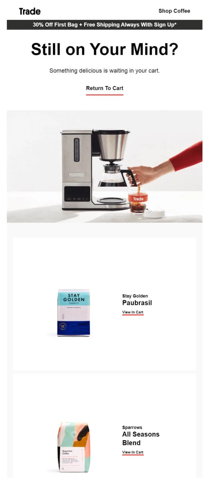
You can show a ziplock bag of coffee beans, or you can show how coffee is made. In the example below, Trade Coffee uses a tidy photo of coffee in the making. As a customer, you might not even want a coffee machine, but the beautiful photo creates just the right story to catch your attention. That’s the main lesson — you need to show off your product in its full glory.
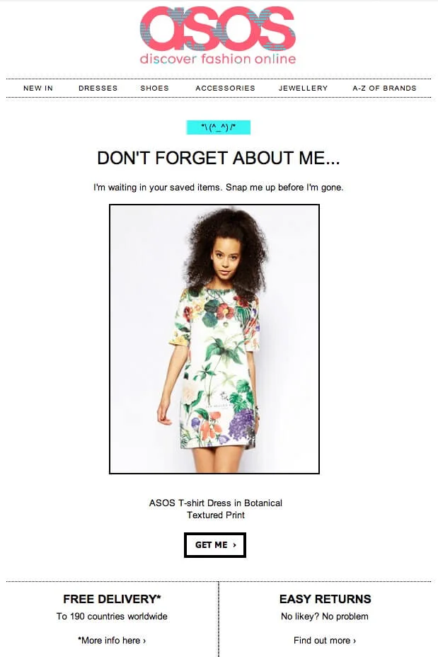
Clothing companies know all about it. You often see real people wearing clothes instead of those clothes lying on the floor. Asos doesn’t make their customers imagine what they’d look like in this dress — they show it.
Strong and simple CTA
Whatever email templates you use, a call to action button should be visible, clear, and well-designed. Usually, a contrasting color is enough to make the CTA button stick out.
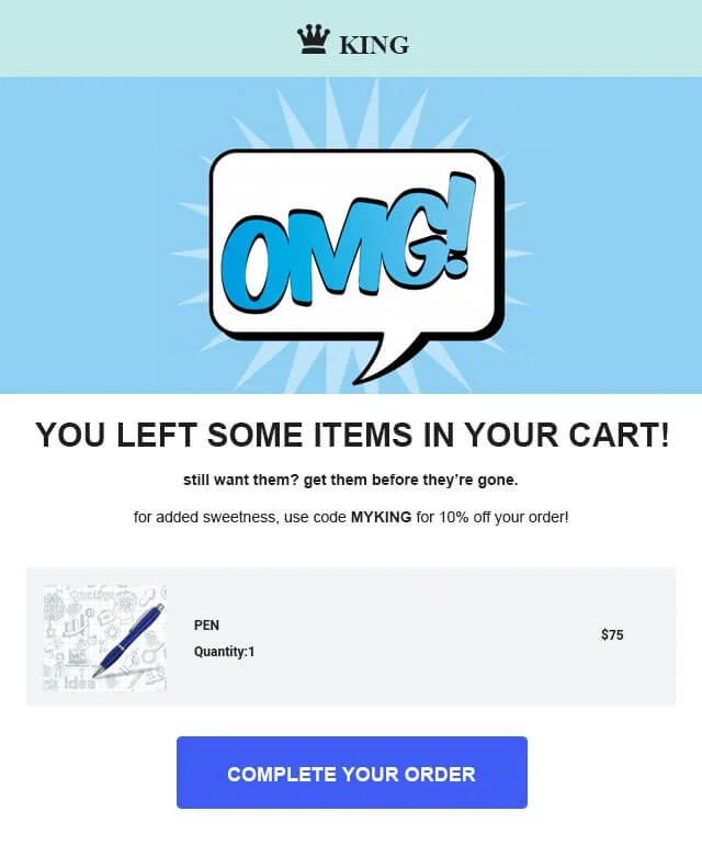
Some good and bad examples now. Look at this call to action button from King: easy to notice thanks to its size and color.
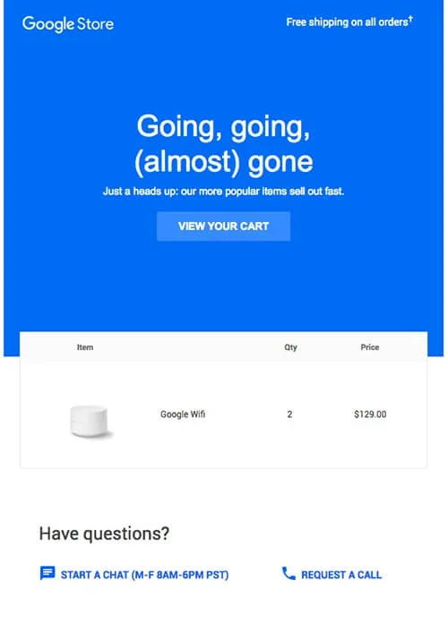
Now look at this one from Google Store. The CTA button is there but one has to try harder to spot it: it’s almost the same blue color as the background.
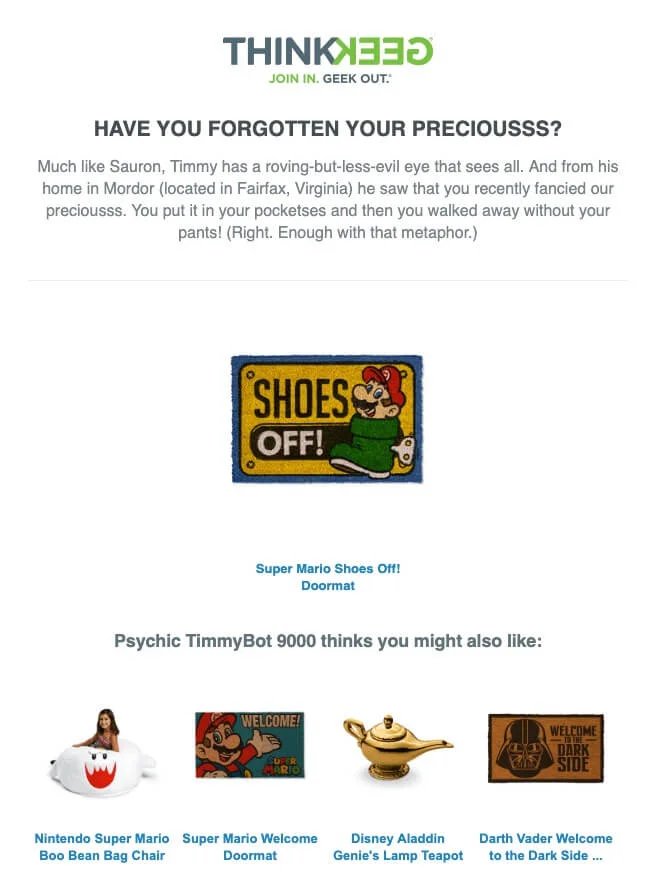
Check out this email from ThinkGeek. Creative copywriting, recommended products — great — but what does it want to achieve without a call to action? It’s an abandoned cart email but does it really look like one?
Social proof and reviews
All of us value other people’s opinions much more than promises from brands themselves. Robert Cialdini put it too well in his classic book Influence: The Psychology of Persuasion:
“When we are uncertain, we are willing to place an enormous amount of trust in the collective knowledge of the crowd…Since 95% of the people are imitators and only 5% initiators, people are persuaded more by the actions of others than by any proof we can offer.”
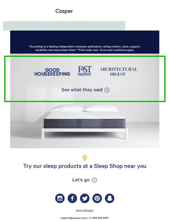
For example, you can use a user rating or review as social proof. You can combine them both, just like Casper did here.
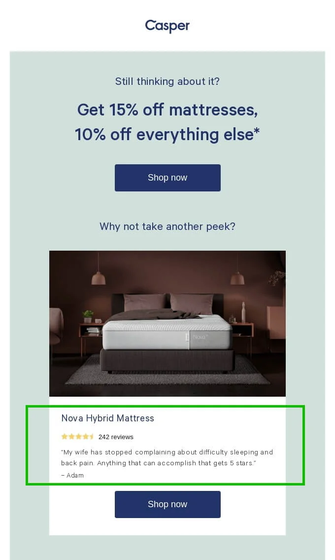
Some companies refer to authority as proof of why their product works. Reference to authority is, by the way, another certain way of persuasion as per Cialdini. Here’s Casper again with an example.
Mobile optimization
In 2025, most people open their emails on mobile devices, meaning your abandoned cart emails, as well as any other marketing messages or online shopping carts emails, should be optimized.
Here are some of the best practices for email mobile optimization:
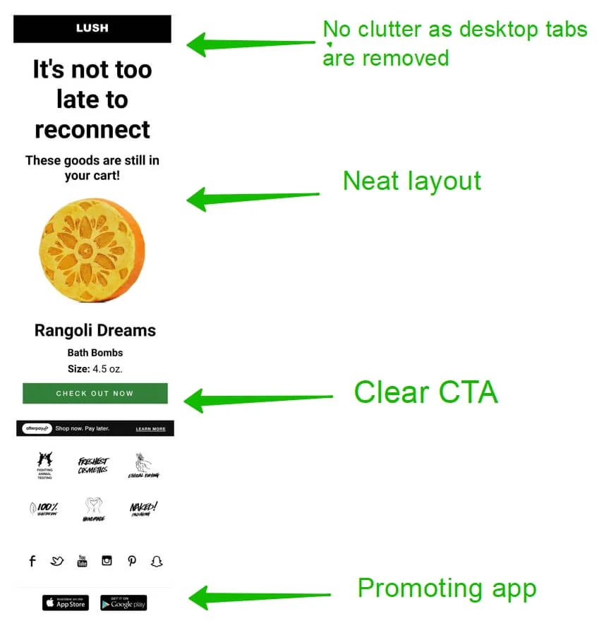
- Collapsible menus. A desktop header can have many tabs, but they may not fit or will look clumsy on a smaller mobile screen. Make the menu collapsible or remove all tabs if they risk damaging the email structure.
- Mobile-friendly imagery. Oversized or undersized images will look bad. Images must be scaled according to the screen size.
- Visible CTA. The call to action button should be visible just like on the desktop.
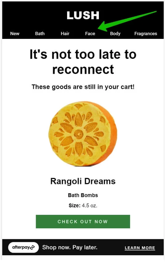
Here’s a good example from Lush. They don’t do anything fancy in the email for mobile. They merely take all the value from the desktop version and adapt it. Swipe to compare.
Timing
In email marketing, timing is everything — that is why we have all those reports on when the best time is to send emails.
With an abandoned cart email, what matters the most is how much time has passed since a customer left the cart. Statistically, the best time here is one hour. In this case, the conversion rate reaches 6.33%. While not everybody is doing so, you still better be quick to stay on top of your potential customers’ minds. A few hours after abandonment can also do the job.
Using the right ESP — Selzy
In email marketing, everything is tied to the right tools. Abandoned cart emails are no exception. You need more than basic ESP’s automation to create them — it must be able to pull data from your online store in real time. Without that connection, it simply won’t know who left what in their cart.
With Selzy, you can set up automation triggered by data from an external source (for example, your website, app, or Shopify store). For example, Selzy can:
- Send the first reminder within the time you set up
- Follow up after a set delay (e.g., 24 hours)
- Personalize your emails: for example, add the customer’s name, list their ordered products, or include a delivery date.
This setup requires either a built-in integration or API triggers, so you may need your IT team to connect the systems (check out the API triggers article from our Help Center for more details). But once it’s in place, every abandoned cart is tracked — and no potential sale slips away unnoticed. Plus, you can try Selzy for free.
11 best abandoned cart email examples and strategies
Here are the best abandoned cart email examples in 2025.
Whisky Loot
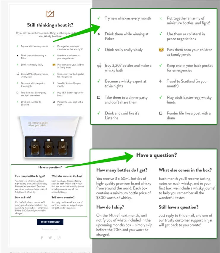
What do we like about it:
- Great example of creative copywriting in the Still thinking about it part and how it can turn an email into a piece of art.
- “Treat yourself “CTA is noticeable and fun,
- “Have a question?” section offers further help to those who haven’t found the right answer.
Timberland
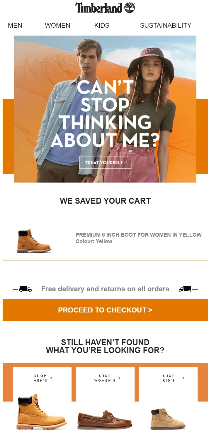
What do we like about it:
- Timberland offers strong visuals — and a great copy. The main line “Can’t stop thinking about me?” also serves as a subject line.
- Product recommendations are well placed and visible.
- CTA button leads straight to check-out to save customers’ time — and their time to think about the purchase.
Design Milk
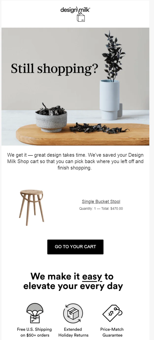
What do we like about it:
- Design Milk’s copy shows care for the customer — no urgency, the right item is saved for them.
- This email also reminds customers about nice offers from the company — free shipping, extended returns, and others.
- Overall, this abandoned cart email is well designed — with cute buttons, an atmospheric picture, and a layout in general.
Nomad
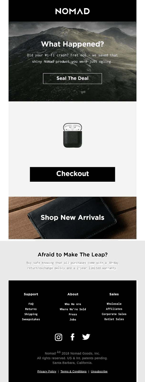
What do we like about it:
- The email reassures users with a 30-day return policy and 2-year warranty — a great strategy to show customers care.
- The copy is full of clever lines — from “Seal the Deal” CTA to the question about crashed Wi-Fi. It poses as care but also pokes fun at the customer a little bit.
Rudy’s
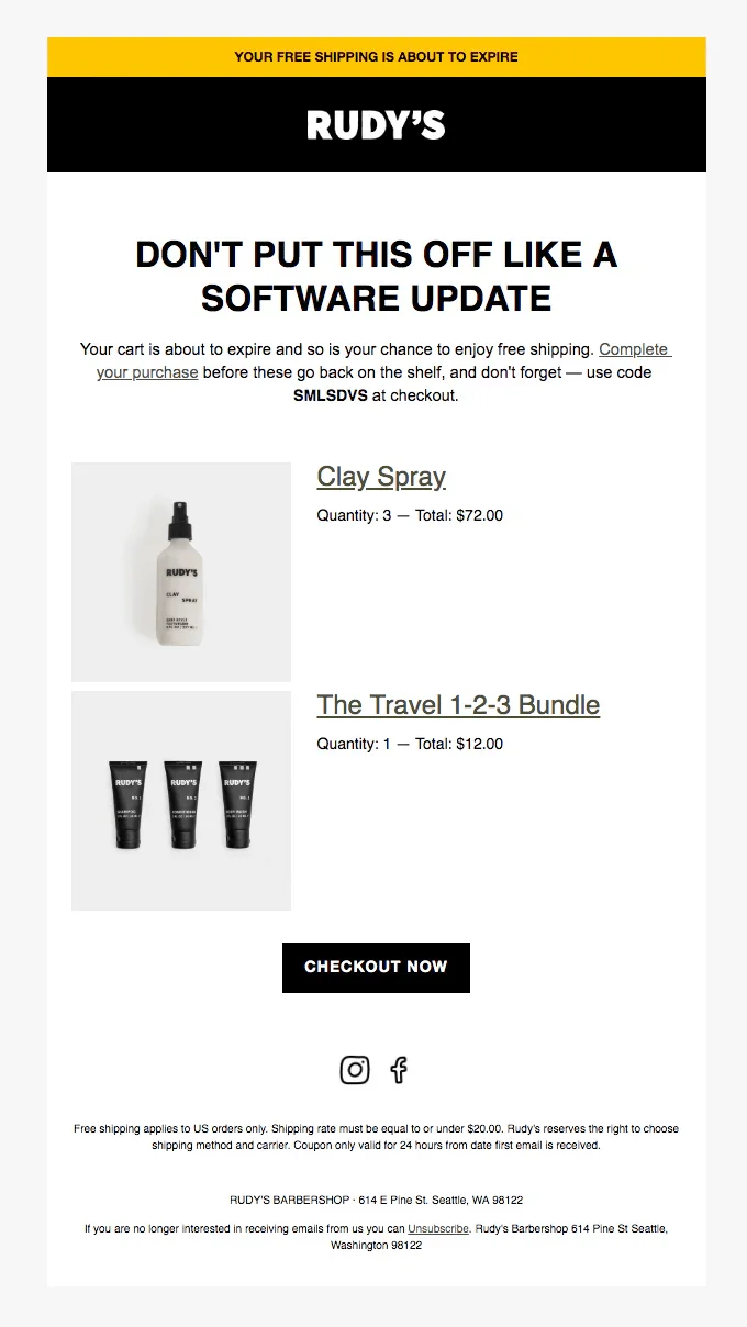
What do we like about it:
- Rudy’s uses the sense of urgency — and reminds a customer that the free shipping offer is about to expire (with a discount code offer).
- This email’s layout is simple and clear — nothing more to shift your attention to.
- The copy is very clever and humorous, which is always nice.
Dollar Shave Club
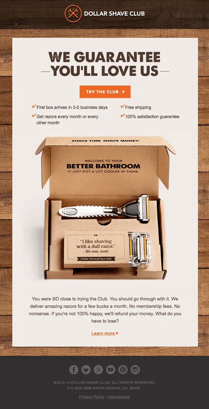
What do we like about it:
- Dollar Shave Club goes all in on trying to persuade a customer to complete the purchase. A love guarantee, a list of all the benefits, and a final message. This might seem like too much, but in a way, it’s endearing.
- A single image is the main focus here — it is clear, beautiful, and stylish. The image is the main selling point after all.
- The layout is super simple — as it should be for a one-type product.
ThreadUp
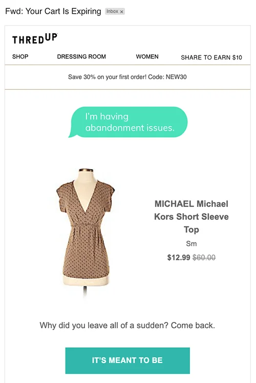
What do we like about it:
- ThreadUp uses humor and even a fun layout with the line “I’m having abandonment issues”. It’s emotionally engaging.
- The discount here is clearly emphasized — a nice strategy to create urgency.
- The CTA button is playful and encouraging.
Bonobos
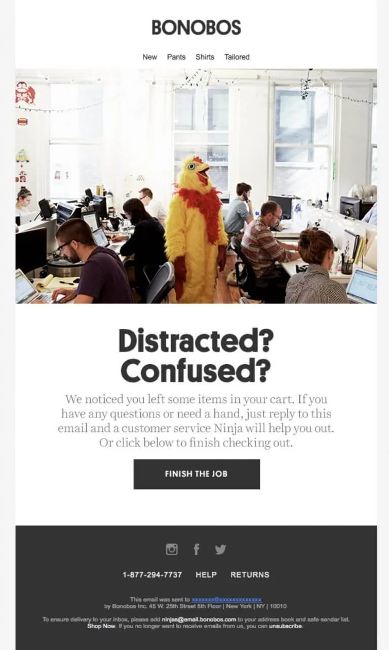
What do we like about it:
- While Bonobos does not display abandoned cart items, the image is eye-catching and humorous. It immediately draws attention and sets a playful tone.
- The email offers direct help by encouraging a reply — adding a personal, human touch.
- Fun brand voice (“customer service Ninja”) fills this email with memorability and friendliness.
- Strong “Finish the Job” CTA is simple, action-oriented, and fits the tone perfectly.
Chubbies
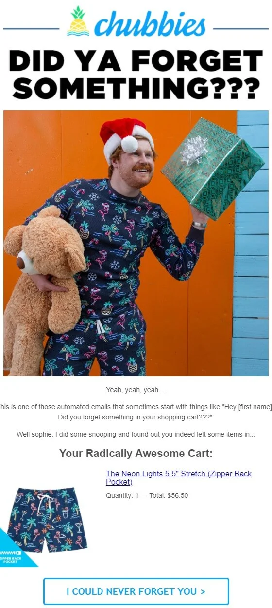
What do we like about it:
- This email has a high-energy tone with humor and personality.
- The copy is clever — it acknowledges the automation in a cheeky, self-aware way.
- Chubbies directly names the customer (“sophie”) for added personalization.
Vans
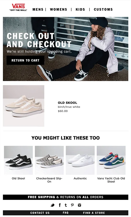
What do we like about it:
- Strong visual branding with a lifestyle picture will probably resonate with the target audience.
- The wordplay in the headline is clever but casual — again, fully Vans style.
- The email shows the exact product left behind, plus relevant alternatives for upselling or second chances.
Forever 21
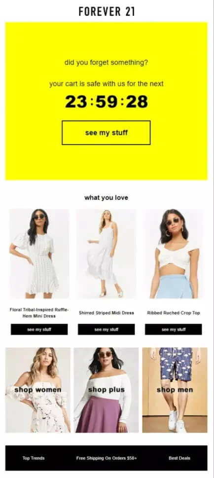
What do we like about it:
- The countdown timer adds urgency in a fun, visually striking way.
- Each item includes a CTA button and encourages immediate return to the cart.
- The email highlights other categories to explore (Women, Plus, Men), increasing engagement.

FAQ
Now that you know what to include in your abandoned cart email — and what it looks like — let’s go over some commonly asked questions.
How effective are abandoned cart emails?
In terms of open rates, click-through rates, and conversions they’re 2-3 times more effective than average emails
What makes the best abandoned cart email?
Here are a few things to consider:
- Timing — it’s best to send this email within an hour.
- A call to action — it must be well-designed and easy to spot.
- Copywriting — use one of several subject line templates, write a persuasive copy.
- Mobile optimization — because most of the emails are opened on mobile devices.
What are the best abandoned cart email strategies?
The best abandoned cart email strategies are:
- Social proof — a powerful means of persuasion.
- Showing product in use — customers see how they can use it.
- Answering potential objections — maybe one of those objections is why the cart is still full.
- Using different CTAs — playful call to action buttons break the routine and engage with customers in a different way.
- Offering alternatives — maybe customers hesitate because they haven’t found their ideal item yet.
- Create a sense of urgency — a deadline activates thinking.
How to create abandoned cart emails?
You need to create a sequence of automated emails. Three is enough:
- reminder,
- new subject line or sense of urgency,
- discount.
By the way, Selzy can help you with all of that — set the triggers, create flows, and emails themselves with our easy and flexible builder. This way, you are always on top of the email game — and the customer’s mind. No bragging, but you can try it for free.
